Playful visual design for indie apps
A while ago, I was listening to the excellent Launched podcast with Charlie Chapman (can’t remember the episode), and they were talking about how it’s almost a cliché for indie developers to design apps “as if Apple had made it.” That really hit me, because it's exactly where my head was at when I started.
Here was my first mock-up:
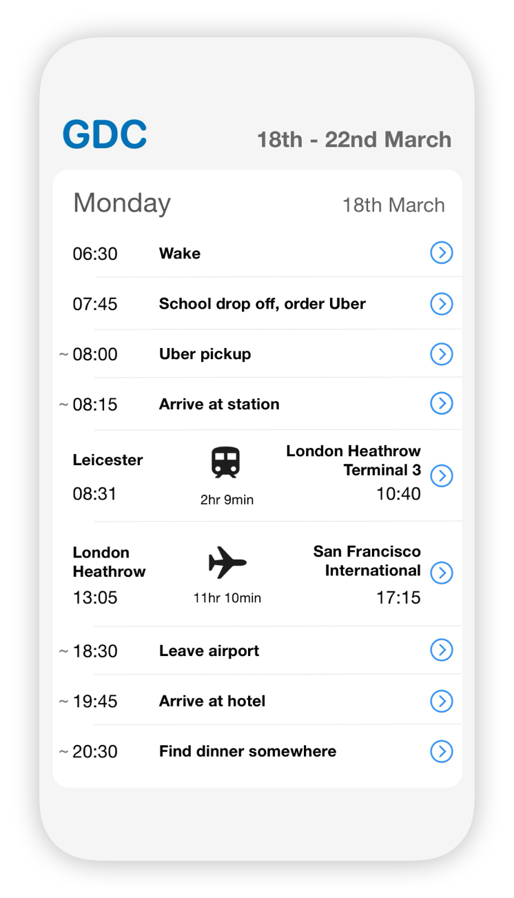
It’s fine, but it felt… generic. The main reference I had in mind was the Apple Reminders app, with the core difference being that each item would have a time attached.
The thing is, people who gravitate toward indie apps on iPhone often want something more exciting. They’re looking for something playful, something that stands out—something that brings a smile to their face.
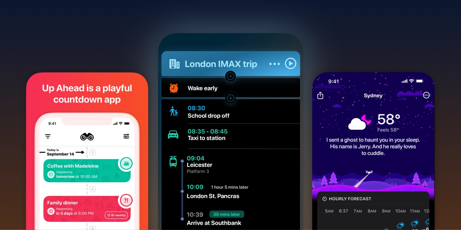
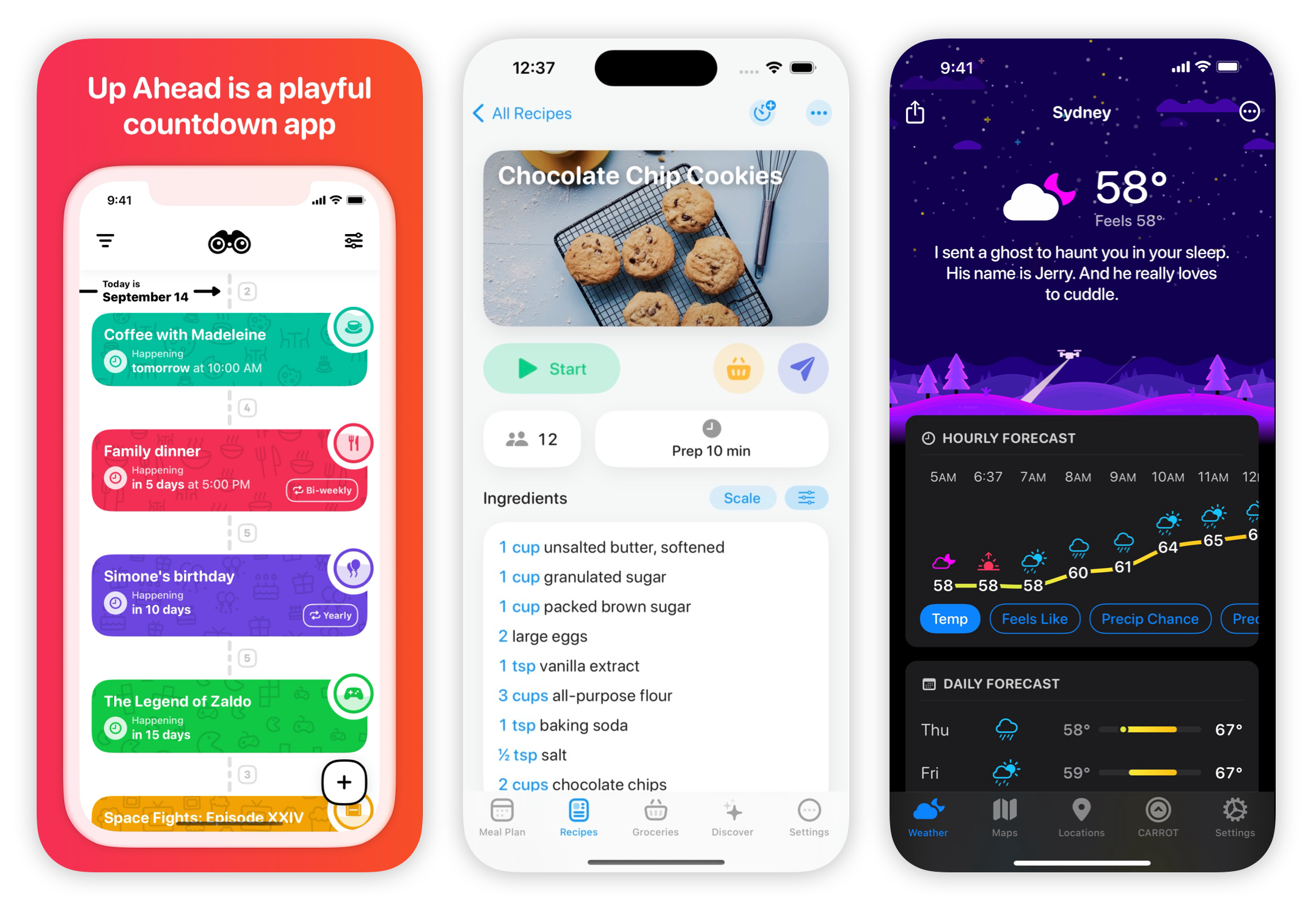
Take apps like Crouton, Up Ahead or CARROT Weather. They’re not just useful—they’re fun, they’re quirky, they’re charming. That’s a big part of their appeal. It doesn’t need to be in-your-face like the Not Boring apps (although those are fantastic too!) It might just be a rainbow colour palette here, or an unusual widget there.
Apple doesn’t need to do this to make high quality apps, because they’re already the default. They need to make apps that just get out of the way and get the job done for the masses. Yes, they want their apps to be beautiful in a minimal elegant sense, but they also need to inoffensive and clutter free. (This has been their brand for almost two decades: extreme polish, no rough edges, almost to a fault.)
Good indie apps are literally colourful. Instead of a cautious accent colour here and there, they can afford to lean a little more into bold, playful palettes.
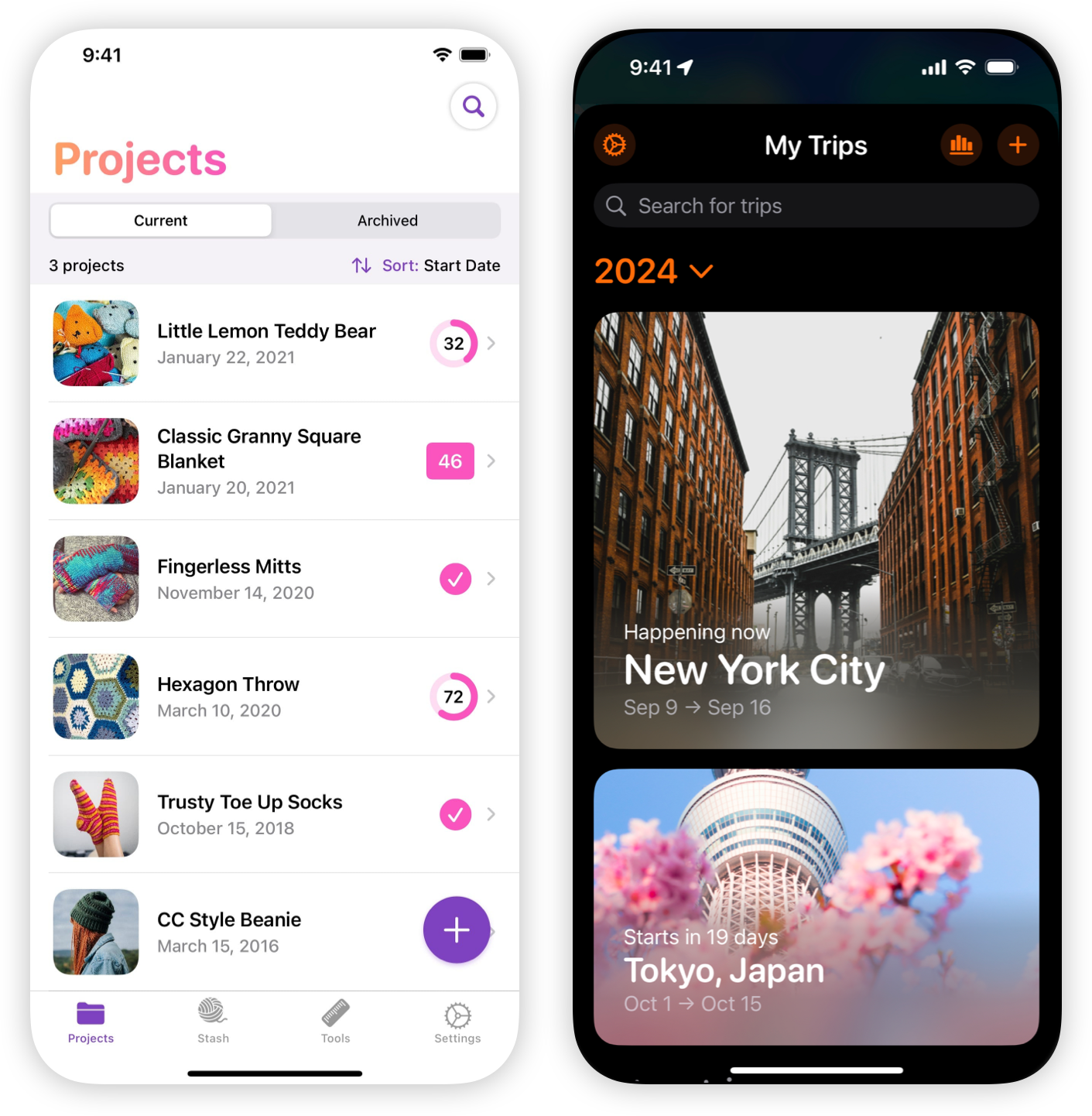
One other thing I’ve noticed is how many apps are using the rounded version of Apple’s San Francisco font. It’s become almost a badge of indie apps—a bit more gentle, quirky and informal than the default UI style:
They can afford to be, and absolutely should be silly, passionate, edgy and surprising.
But it’s a fine line. Go too far, and you risk slipping into clunky, overly custom designs—like a bad banking app, or that one annoying local public transport app you have to use. The problem isn’t just that it looks cheap; it’s that it actively gets in the way. Apple’s default UI works for a reason—it’s refined, polished, and it just gets the job done.
That’s the challenge: how to make the app feel joyful and different, without messing up what makes it usable.
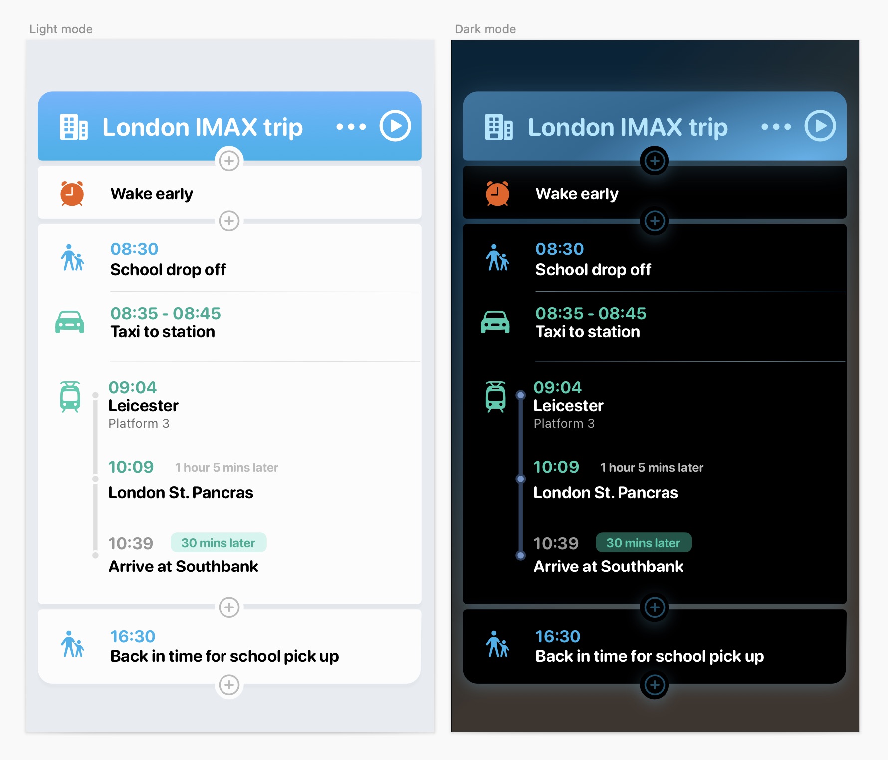
So here are my latest mock-ups, though I'm sure it's still got a few more iterations left before the first public release:
It’s still early days, but I’m excited to keep experimenting. I’ll share more as it comes together, and if you’re curious—or if I maybe, possibly, decide to do a TestFlight—sign up below.

